Company
Towhelp
Timeline
4 weeks
—
2025
Role
Logo, Brand identity designer & UI / UX Designer

Project overview
TowHelp is a roadside assistance and towing service brand focused on delivering fast, reliable help wherever drivers are. Owl Design Studio was commissioned to create a complete brand identity system that communicates strength, accessibility, and trust—while remaining adaptable across digital products and real-world applications.
The project extended beyond logo design to include a full brand guideline system, visual consistency across touchpoints, UI-focused elements, and digital-ready assets.
Challenges
TowHelp required a brand identity that feels bold and dependable without falling into generic automotive visuals.
The challenge was to create a system that works seamlessly across physical environments and digital platforms (applications, interfaces, and social media), while maintaining clarity and consistency.
The brand also needed to feel intuitive and approachable, reflecting its mission to provide help quickly, wherever the customer is.


Results
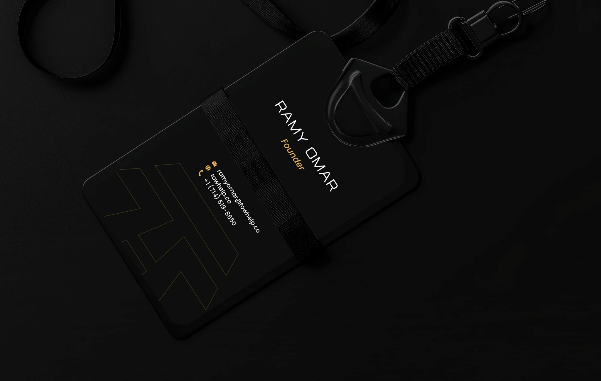
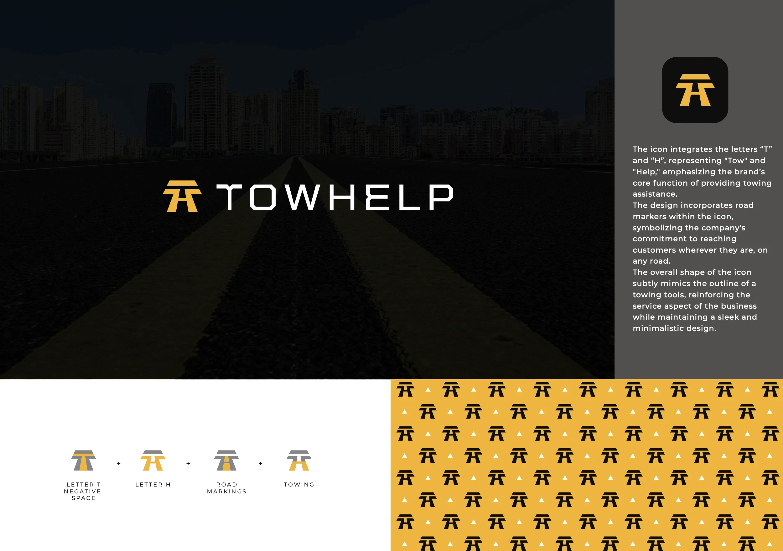
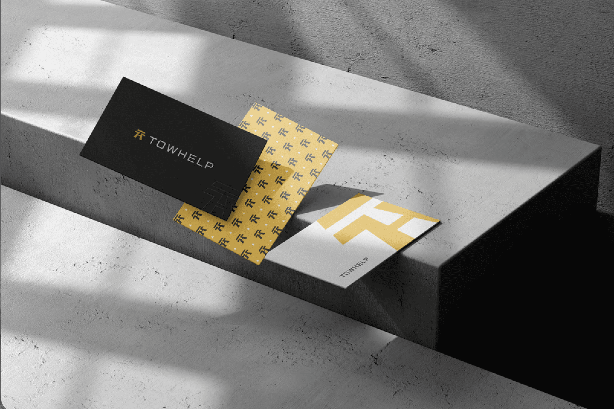
The TowHelp icon integrates the letters “T” and “H,” representing Tow and Help, emphasizing the brand’s core function of roadside assistance.
Road markers are embedded within the icon, symbolizing reach, accessibility, and the idea of meeting customers on any road, at any time. The overall structure subtly echoes the form of towing tools, reinforcing the service-based nature of the business while maintaining a clean, minimal, and modern aesthetic.
The result is a strong, recognizable mark built on concept—not decoration—capable of scaling across physical and digital environments.

Company
Towhelp
Timeline
4 weeks
—
2025
Role
Logo, Brand identity designer & UI / UX Designer
Project overview
TowHelp is a roadside assistance and towing service brand focused on delivering fast, reliable help wherever drivers are. Owl Design Studio was commissioned to create a complete brand identity system that communicates strength, accessibility, and trust—while remaining adaptable across digital products and real-world applications.
The project extended beyond logo design to include a full brand guideline system, visual consistency across touchpoints, UI-focused elements, and digital-ready assets.
Challenges
TowHelp required a brand identity that feels bold and dependable without falling into generic automotive visuals.
The challenge was to create a system that works seamlessly across physical environments and digital platforms (applications, interfaces, and social media), while maintaining clarity and consistency.
The brand also needed to feel intuitive and approachable, reflecting its mission to provide help quickly, wherever the customer is.
Results
The TowHelp icon integrates the letters “T” and “H,” representing Tow and Help, emphasizing the brand’s core function of roadside assistance.
Road markers are embedded within the icon, symbolizing reach, accessibility, and the idea of meeting customers on any road, at any time. The overall structure subtly echoes the form of towing tools, reinforcing the service-based nature of the business while maintaining a clean, minimal, and modern aesthetic.
The result is a strong, recognizable mark built on concept—not decoration—capable of scaling across physical and digital environments.