Sokkat Al Teeb is a well-established Saudi fragrance brand founded in 1999. With over 25 years in the market, the brand has built a strong reputation in perfumes and incense (Bukhoor), becoming a trusted and recognizable name in the Kingdom of Saudi Arabia. It is a heritage-driven brand with a loyal audience and deep cultural presence — which made the rebranding process both sensitive and strategic.
Company
Mansour Almatroodi
Timeline
2023
—
5 Weeks
Role
Branding Designer
Project overview
Sokkat Al Teeb approached me to redesign their visual identity while preserving their legacy.
The goal was not to create a completely new brand — but to elevate and modernize an iconic one without losing its soul.
The scope of the project included:
Logo redesign
Full brand identity system
Packaging system
Business cards & stationery
Envelopes
Presentation templates
Retail stand design
Product boxes
All essential brand assets
This was a complete transformation across all touchpoints.
Challenges
Rebranding a 25+ year old heritage brand is never simple.
The main challenges were:
The old logo had very thin, overlapping typography.
It was visually crowded and lacked clarity.
The circular shape was iconic and familiar to the audience.
The client was emotionally attached to the original mark.
The brand needed modernization without alienating loyal customers.
The biggest challenge was:
How do you modernize a legacy brand without breaking its identity?
I decided to preserve the core circular structure, maintaining the visual memory of the brand, while redesigning everything inside it.
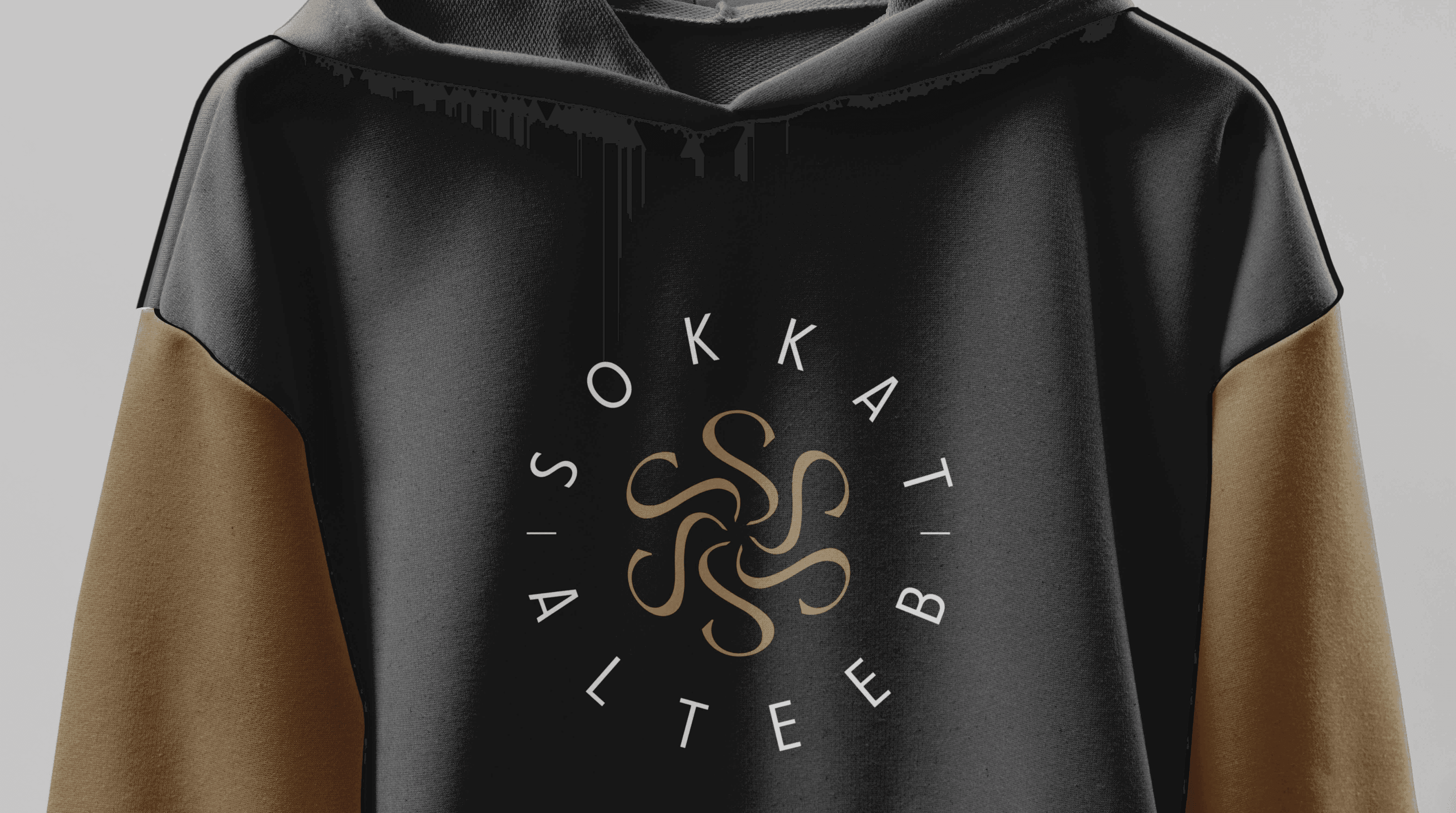
Key Concepts Behind the New Logo:
The brand name begins with “S”, so I developed a custom asset built around the letter.
The form of the “S” subtly resembles rising incense smoke, ymbolizing Bukhoor.
The smoke originates from the center, creating a fluid, elegant movement.
The circle remains as a frame of heritage and continuity.
Typography was redesigned to be:
Cleaner
More legible
Balanced
Luxurious
Minimal
The result is a logo that feels:
Modern
Premium
Clear
Sophisticated
Culturally relevant
Yet deeply rooted in its origin
Results
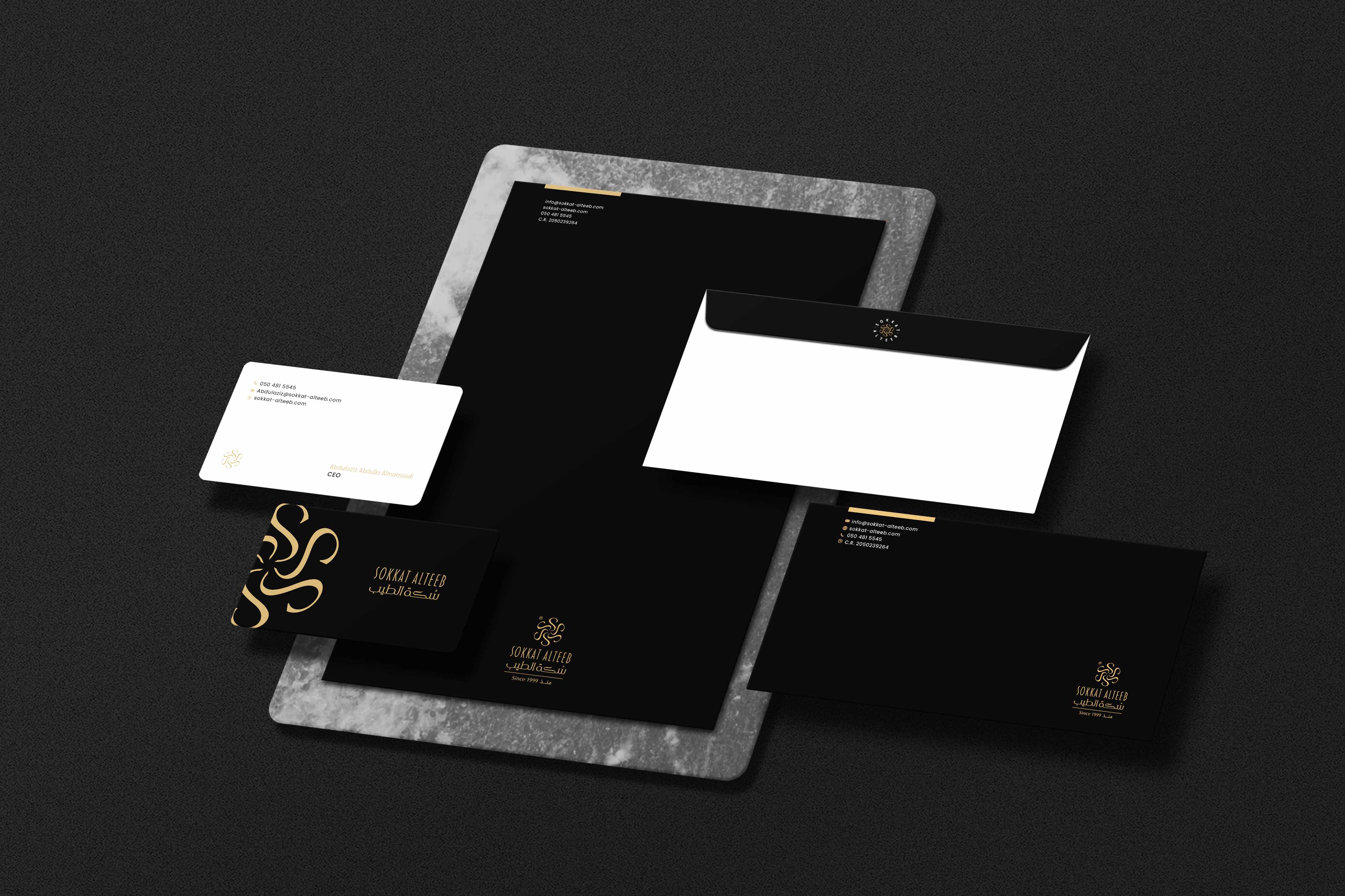
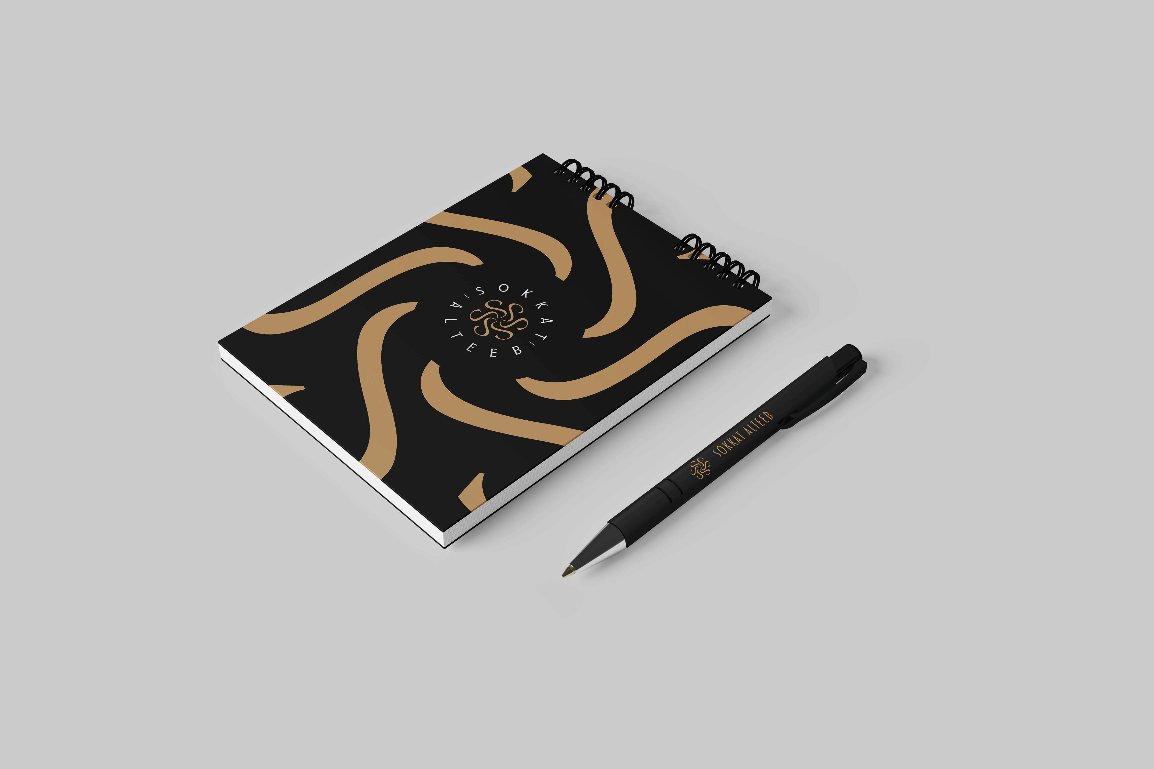
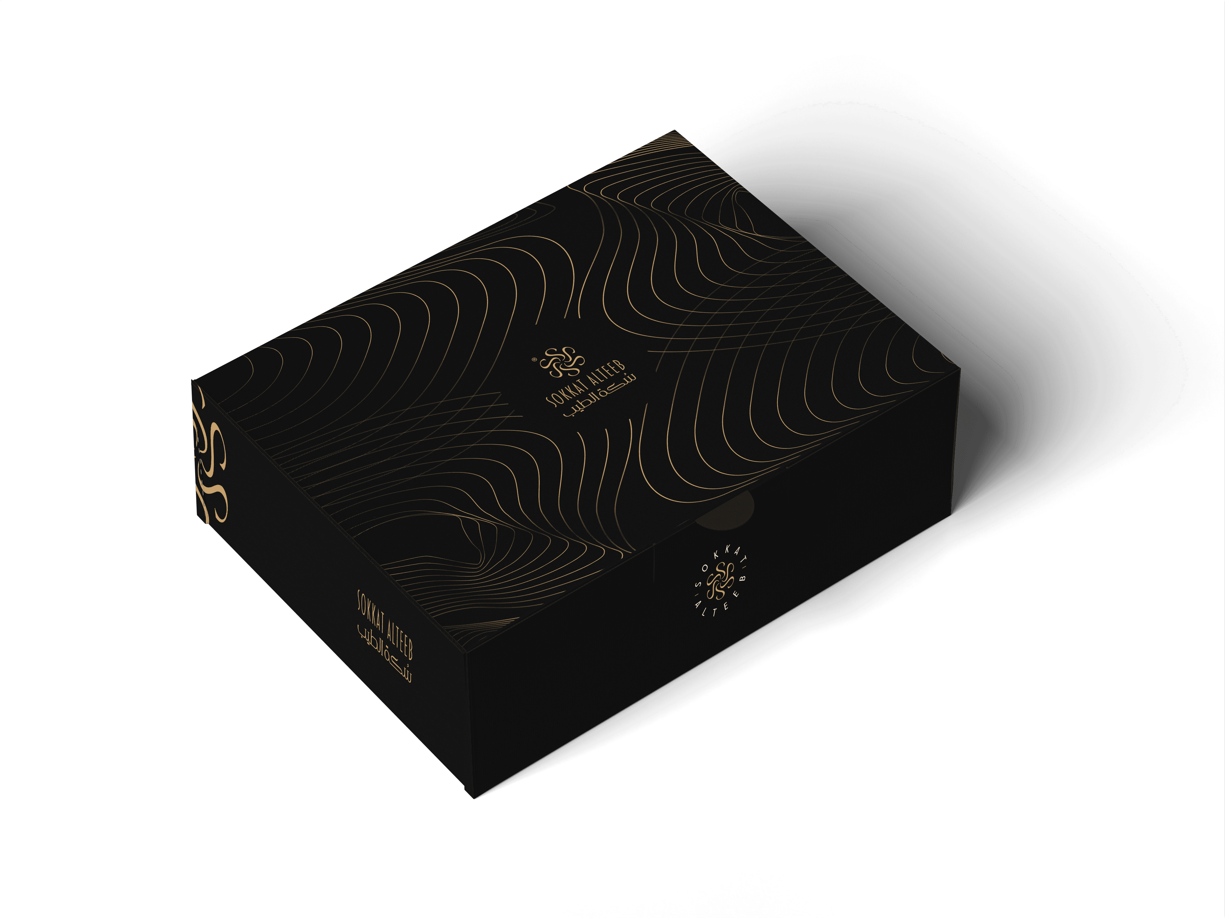
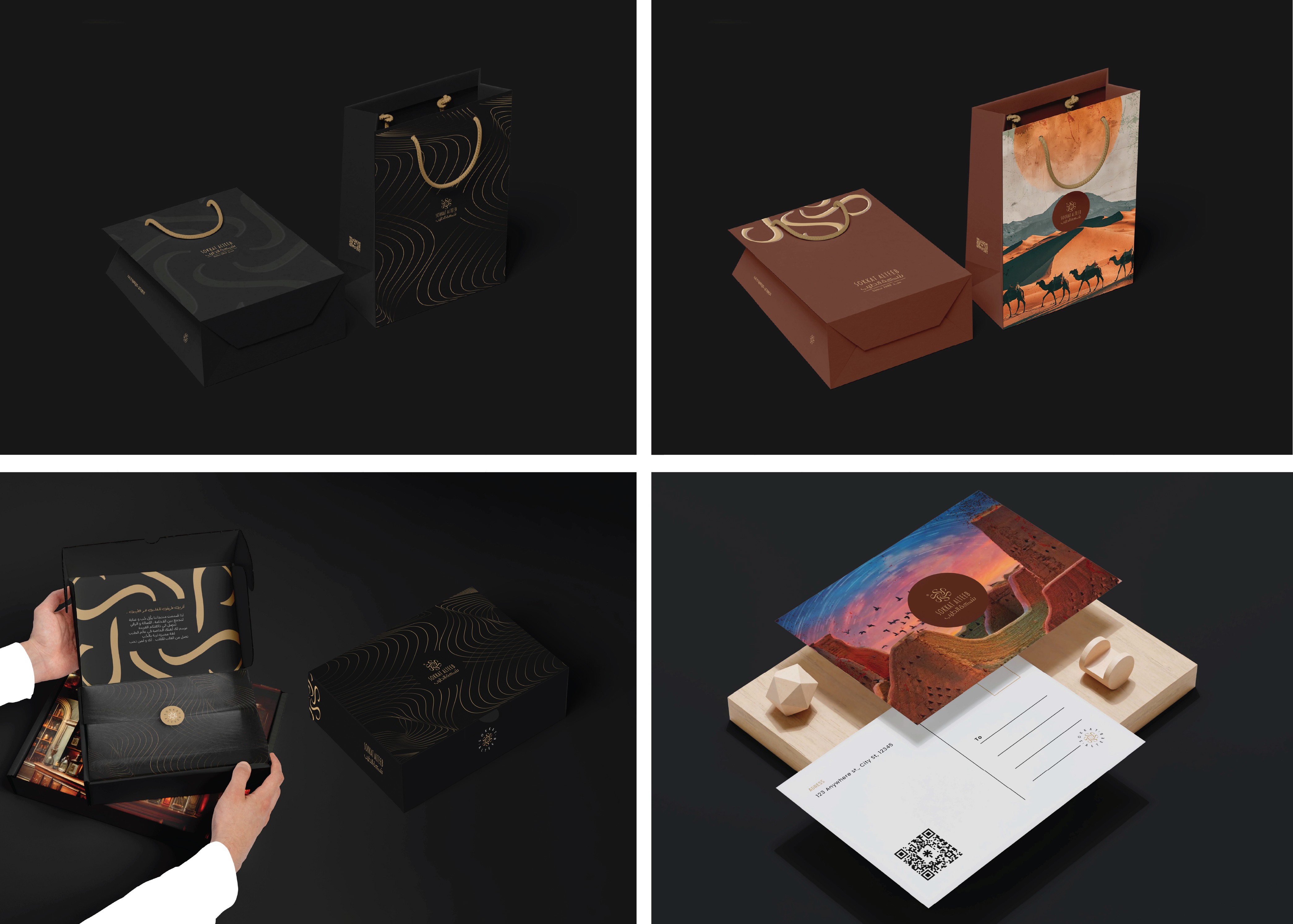
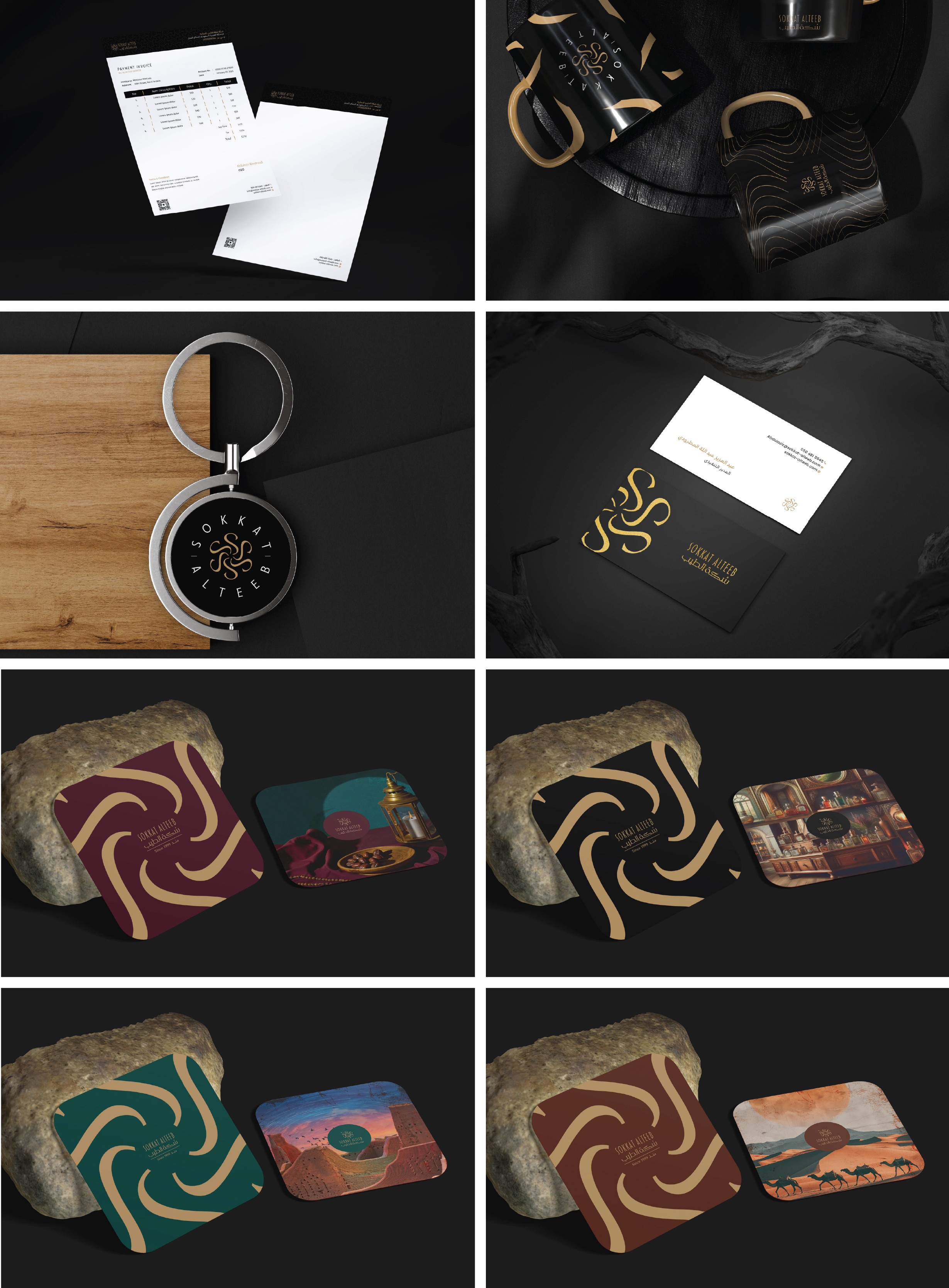
Brand System & Extensions
Because the logo evolved, the entire ecosystem evolved with it.
I designed:
Luxury packaging system
Structured box designs
Premium business cards
Envelopes & corporate stationery
Retail stand concept
Presentation materials
Visual hierarchy system
Asset-based branding language
The identity was built to be scalable across retail, digital, and physical spaces, maintaining consistency and elegance.
Results
The client was extremely satisfied and emotionally moved by the transformation.
The audience instantly recognized the brand due to the preserved circular structure.
The new logo feels lighter, cleaner, and more premium.
The brand shifted from traditional-heavy to modern-luxury.
It strengthened the perception of Sokkat Al Teeb as a timeless yet evolving brand.
Most importantly:
We didn’t just redesign a logo.
We repositioned a heritage brand for the next 25 years.


Sokkat Al Teeb is a well-established Saudi fragrance brand founded in 1999. With over 25 years in the market, the brand has built a strong reputation in perfumes and incense (Bukhoor), becoming a trusted and recognizable name in the Kingdom of Saudi Arabia. It is a heritage-driven brand with a loyal audience and deep cultural presence — which made the rebranding process both sensitive and strategic.
Company
Mansour Almatroodi
Timeline
2023
—
5 Weeks
Role
Branding Designer
Project overview
Sokkat Al Teeb approached me to redesign their visual identity while preserving their legacy.
The goal was not to create a completely new brand — but to elevate and modernize an iconic one without losing its soul.
The scope of the project included:
Logo redesign
Full brand identity system
Packaging system
Business cards & stationery
Envelopes
Presentation templates
Retail stand design
Product boxes
All essential brand assets
This was a complete transformation across all touchpoints.
Challenges
Rebranding a 25+ year old heritage brand is never simple.
The main challenges were:
The old logo had very thin, overlapping typography.
It was visually crowded and lacked clarity.
The circular shape was iconic and familiar to the audience.
The client was emotionally attached to the original mark.
The brand needed modernization without alienating loyal customers.
The biggest challenge was:
How do you modernize a legacy brand without breaking its identity?
I decided to preserve the core circular structure, maintaining the visual memory of the brand, while redesigning everything inside it.
Key Concepts Behind the New Logo:
The brand name begins with “S”, so I developed a custom asset built around the letter.
The form of the “S” subtly resembles rising incense smoke, ymbolizing Bukhoor.
The smoke originates from the center, creating a fluid, elegant movement.
The circle remains as a frame of heritage and continuity.
Typography was redesigned to be:
Cleaner
More legible
Balanced
Luxurious
Minimal
The result is a logo that feels:
Modern
Premium
Clear
Sophisticated
Culturally relevant
Yet deeply rooted in its origin
Results
Brand System & Extensions
Because the logo evolved, the entire ecosystem evolved with it.
I designed:
Luxury packaging system
Structured box designs
Premium business cards
Envelopes & corporate stationery
Retail stand concept
Presentation materials
Visual hierarchy system
Asset-based branding language
The identity was built to be scalable across retail, digital, and physical spaces, maintaining consistency and elegance.
Results
The client was extremely satisfied and emotionally moved by the transformation.
The audience instantly recognized the brand due to the preserved circular structure.
The new logo feels lighter, cleaner, and more premium.
The brand shifted from traditional-heavy to modern-luxury.
It strengthened the perception of Sokkat Al Teeb as a timeless yet evolving brand.
Most importantly:
We didn’t just redesign a logo.
We repositioned a heritage brand for the next 25 years.